
Google Messages | Image Credit – Google
Google Messages users are seeing three different versions of the app’s branding right now.
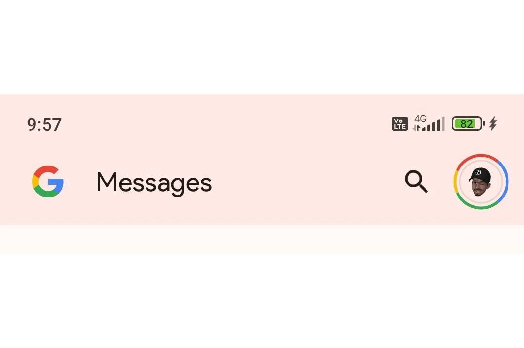
For a long time, the Google Messages app featured the well-recognized multi-colored “G” logo. Last month, a report stated that the company would drop the logo for the app’s full name, a change that began appearing for some users recently. Instead of the icon, the app showed the Google wordmark followed by “Messages” in a standard font.
Google Messages is abandoning the “G” logo. | Image Credit – Reddit user LegitGuard
Initially, the name of the app appeared in white font, even though the July report said to expect the full-color logo. It was right on the money, with one user now seeing the Google wordmark in its multi-colored Blue, Red, Yellow, and Green scheme.
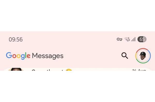
All users will likely ultimately see the full name of the app, with the word Google in colorful letters. | Image Credit – Reddit user LegitGuard
That’s how the names of many Google apps, with some exceptions like Google Maps, are rendered.
The change appears to be rolling out very slowly, with most users saying it’s not live on their end yet. Also, these changes are only shipping for beta users for now, while stable users still see the “G” logo.
On the surface, this is a small change, and not many people will care whether they see a rainbow-colored icon or the full name of the app as long as it works as intended.
That said, having an app display its full name instead of just an icon can make a world of difference to customers who aren’t tech-savvy.
Besides, the header of many other popular Google apps also shows the full name, and having harmony in branding across different apps makes sense.

“Iconic Phones” is coming this Fall!
Good news everyone! Over the past year we’ve been working on an exciting passion project of ours and we’re thrilled to announce it will be ready to release in just a few short months.
LEARN MORE AND SIGN UP FOR EARLY BIRD DISCOUNTS HERE
#bigger #Google #Messages #branding #change #spotted