
A cleaner, less cluttered video player
The biggest update here is a refreshed video player. YouTube has reworked the interface so buttons and icons cover less of the video – a subtle but welcome tweak that keeps your screen focused on what matters most.
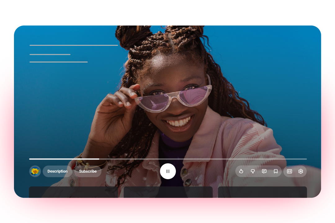
YouTube is launching a cleaner and more immersive video player across mobile, web, and TV devices. | Image credit – Google
This cleaner design has been in testing for a few weeks with select users, so it might already look familiar to some. The double-tap-to-seek gesture is also getting a refresh that YouTube calls “more modern and less intrusive,” meaning those quick skips forward or backward should now feel smoother and less distracting.
On mobile, switching between tabs will now feel snappier too, thanks to improved motion design that makes navigation more fluid.
If you are someone who dives into the comments (and maybe even the replies), you’ll spot a big change there too. YouTube is officially bringing threaded replies to everyone – a feature that was recently tested with Premium users.
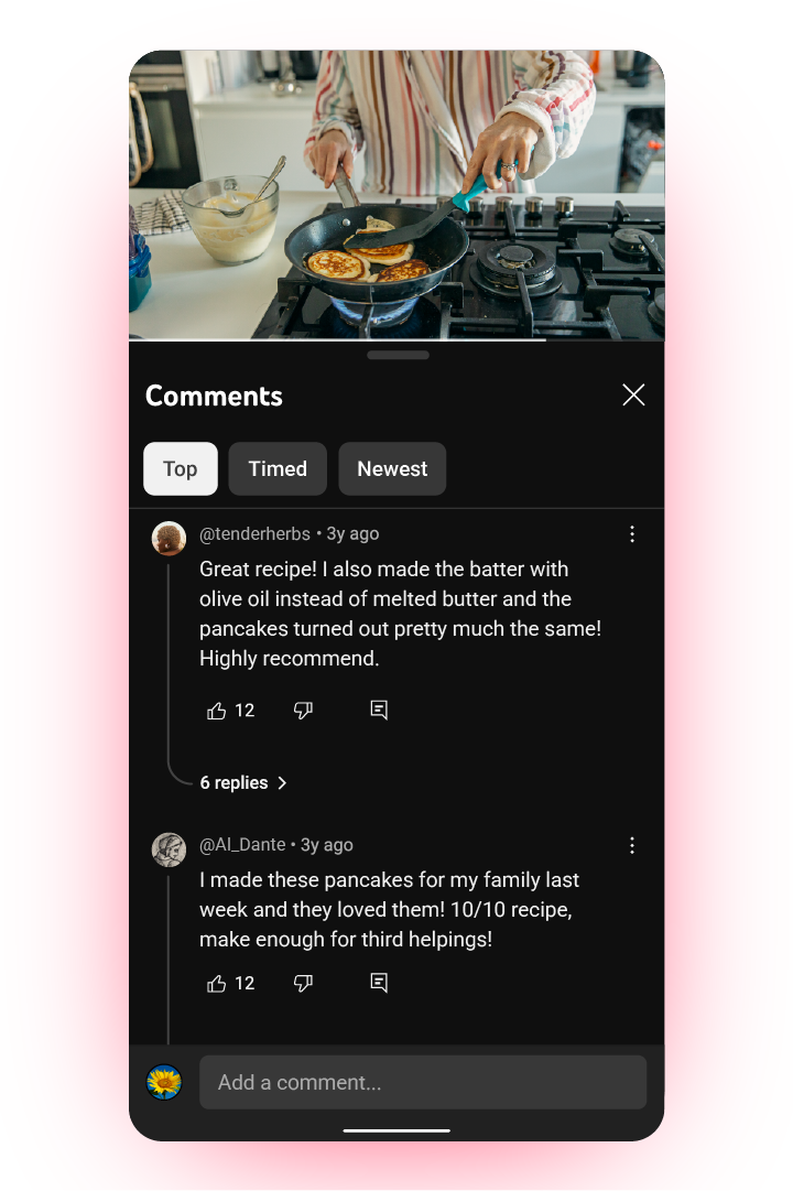
This is what the new comment layout will look like for everyone once the update goes live. | Image credit – Google
Change always feels weird – until it doesn’t
At first glance, these tweaks might seem unnecessary, especially if you are already comfortable with YouTube’s interface. But it is clear that Google is still actively refining the experience, aiming to keep the world’s biggest video platform fresh without messing with its familiar feel.
The YouTube you know, just a bit more polished
If you are the kind of person who lives on YouTube – bouncing between videos, threads, and playlists – these upgrades will probably grow on you fast. It’s YouTube getting a little smarter, more visual, and more enjoyable, at least in my opinion.

“Iconic Phones” is coming this Fall!
#YouTube #feels #today #youre #imagining